Have you ever wondered how it was possible that all of the ePub readers for Android sucked so hard? Turns out the don’t all suck, it’s just their User Interface design that does.
![]()
Well, I just discovered that Aldiko Reader, an app that I tried and dismissed a long time ago, is much more resourceful and featureful than it looks: those features are just very well hidden (and absolutely not advertised in the app’s Play Store page… talk about SEO suckage).
So without further ado: here how to bring your Aldiko Reader in the new millennium (aka: embedded fonts, good layout and even SVG embedding!).
Step One: Install
Install Aldiko Reader (free) from the Play Store (many phones have it preinstalled: check the version though, if it’s older than 2.1.0 you can probably install the newer one in parallel).
Step Two: Import
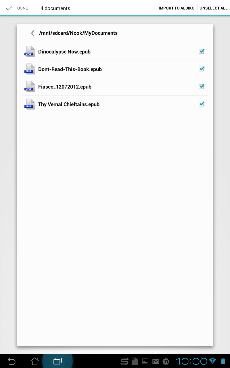
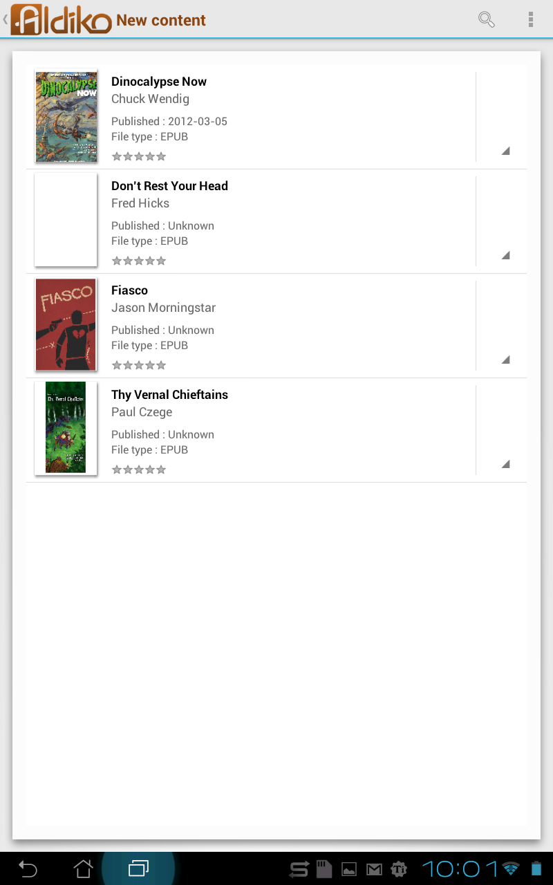
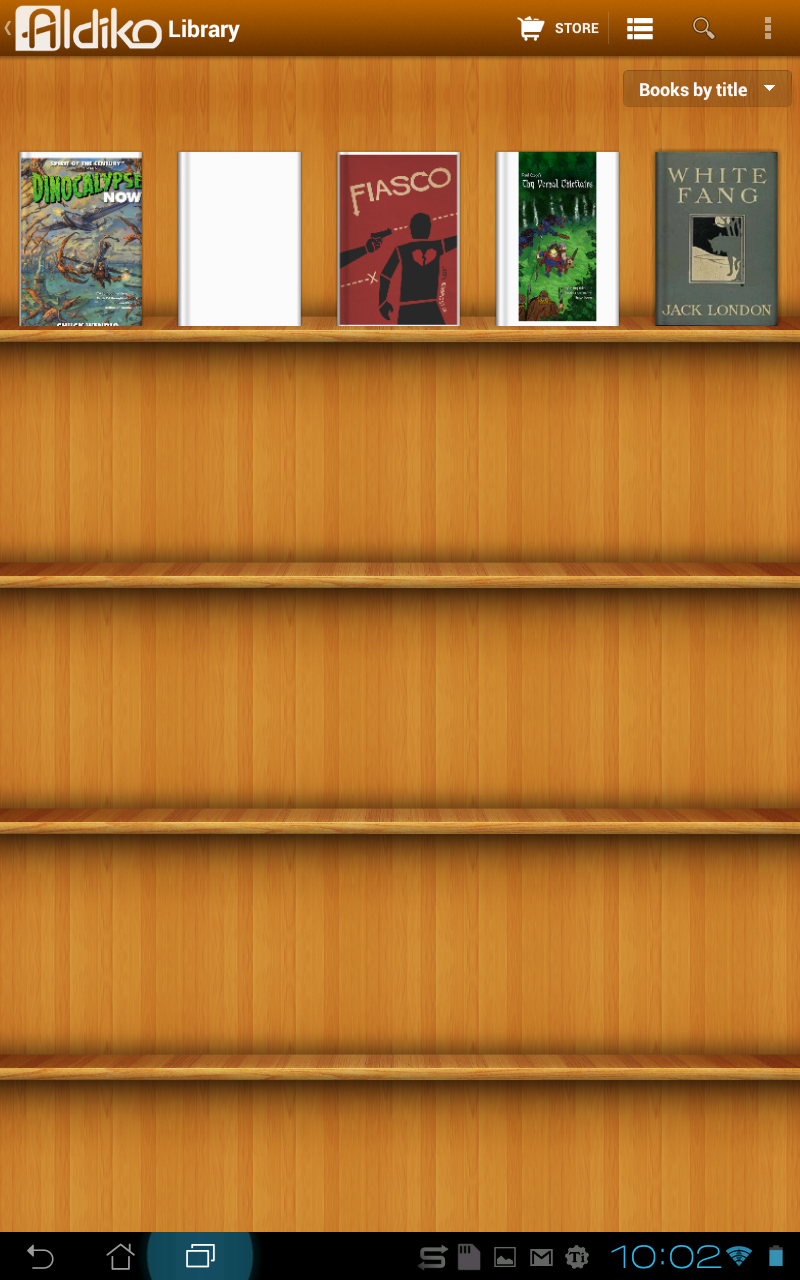
Import your spiffy ePub tapping on Files, browsing, selecting them and choosing “Import to aldiko”
Step 2.1
Step 2.2
Step 2.3
Step 2.4
Step Three: Open a book…
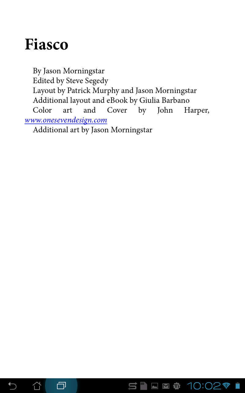
Now open your book. I know, none of the layout works (that’s my point!), not even the Italics, most likely.
Step 3.1
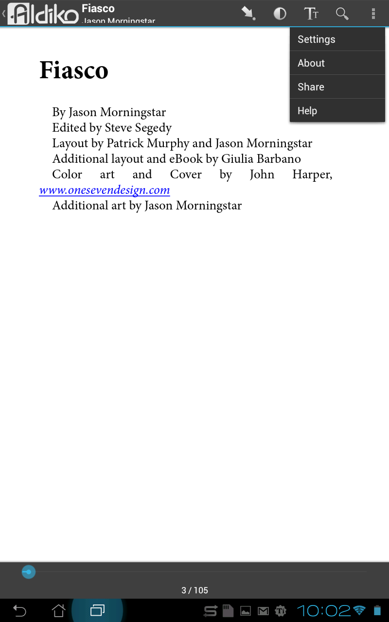
Step Four: Find the “More Settings”
Tap on the page, or the Menu button, then open the Settings, More... menu UPDATE: the app has been updated and the options menu has moved (but it’s still there). New screenshots soon…
Step 4.1
Step Five: Fix the Suckage
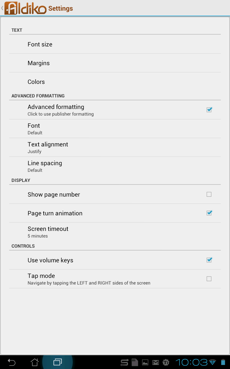
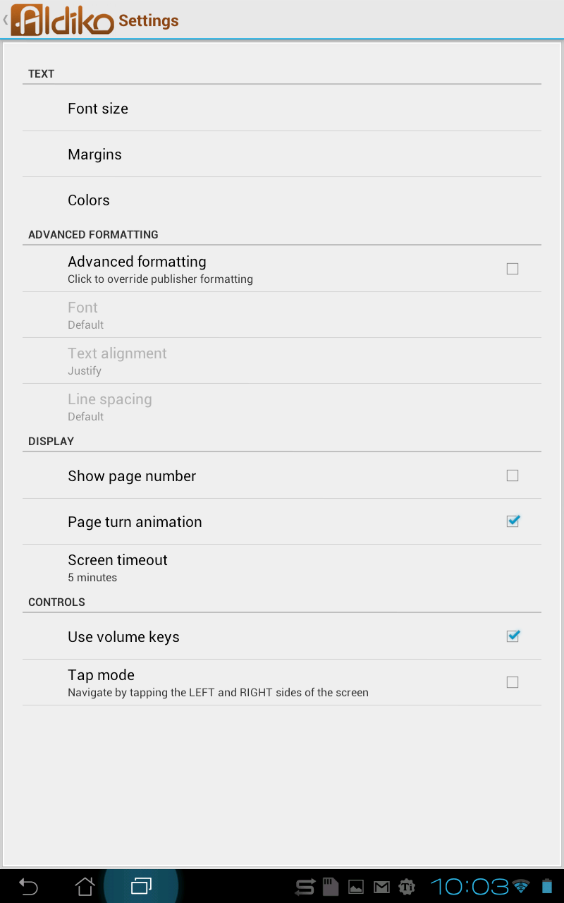
Here comes the magic (and the WTF): uncheck the “Advanced Formatting” option (srsly, yes).
This actually enables the ePub advanced formatting that the publisher so lovingly programmed in the book. so this…
Step 5.1 (So this...)
Step 5.2 (...becomes this)
Step Six: Rejoice!
Go back to your book and rejoice! Fonts! Colors! Styles! Actual layout! Even SVG illustrations are correctly (and rather beautifully) rendered! The mind just reels, right?
Step 6.1
Now, small rant: defaults matter.
I’m sure it you have any interest in UI design you heard this mantra over and over again. It’s because it’s fucking true. Defaults matter.
Choosing to not use the publisher’s layout by default is a completely bone-headed choice, UI wise. Remember: 70% of the users (maybe more) never change the defaults.
So they’ll think your reader sucks, because it does not render stuff that even ADE (Adobe Digital Editions) does, on tiny underpowered and OLD devices like my BeBook Mini.
The fact that the settings for this further confuse the matter just makes things worse. Why the hell would a sane person call a setting “Advanced Formatting” (with the text underneath that says “Click to enable publisher’s formatting” or something), when DESELECTING it (to be fair, “clickng it”, like the line suggests) actually activates the true Advanced Formatting?
It’s cool that there is an override to disable fonts and layout: some people’s idea of a good layout sometimes suck, with unreadable fonts and busy pages. But that’s an Accessibility matter, and should certainly not be the default!
Sidenote: There actually already was a good ebook reader for Android… it’s just not widely available: the Barnes & Noble Nook reader does use embedded fonts in epubs, SVG illustrations and so on, it’s really a pretty good epub reader. Problem is, it’s officially available only on the Nook reader! Now, if you know where to look you can actually find perfectly good installable apks of it, but I can’t consider it a valid alternative for the casual user. It’s not even supposed to be available in my country! And even then, you have to enable “Publisher Defaults” to see the correct layout. Note: screenshots will follow, later, for each step.