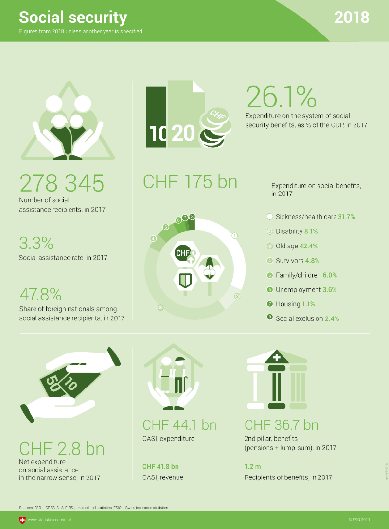
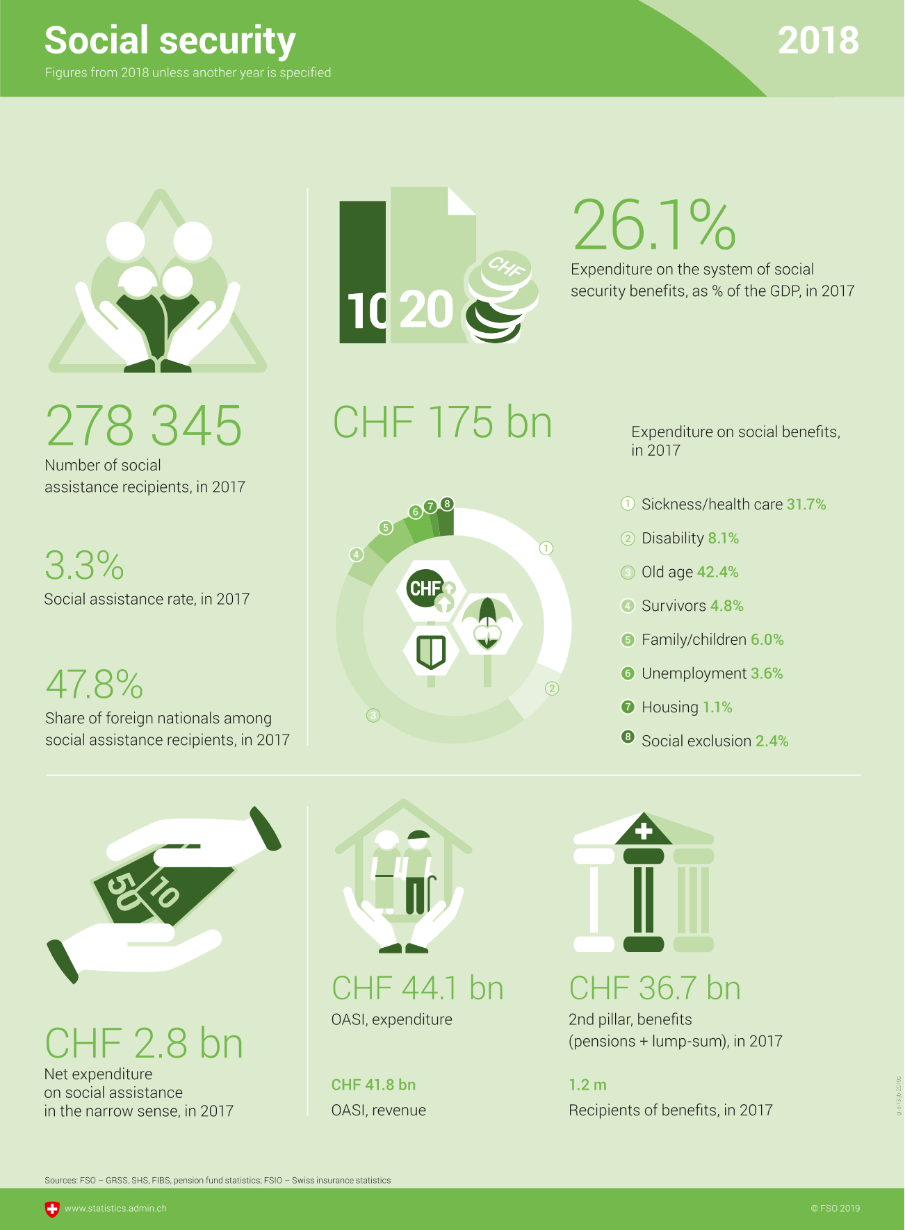
Infographic for 2018 Social security stats
I was selected among the yearly 3% of the population in Switzerland to do a questionnaire about some stats; not a full census, just a few questions about housing, education, personal transport.
Not only the questionnaire is well implemented on the web (and I could have easily done it on a smartphone), it was pretty quick and painless… and at the end I was treated to a nice page of infographics explaining why my involvement is important, because statistics help making informed policy decisions, and so on. Again, very well made page, nice infographics, enthusiastic but professional tone… all in 4 languages, obviously (Italian, German, French and English… no Romantsch, strangely)!
This is one of the small ways this country delights me: bureaucracy… that WORKS! Amazing.

